

Poppet, Katherine Stone, 2015, oil on panel, 20 x 30 inches
Katherine Stone, an artist, living on Vancouver Island, British Columbia, uses a palette based primarily on earth colors from Rublev Colours Artists Oils and other Rublev Colours oil painting mediums, such as Velazquez Medium. In this article, she discusses her technique in the portrait painting Poppet, one of the finalists in the 2015 Portrait Society of America competition.
Shop Now for
As usual, I started with a drawing to work out my composition. This time I used graphite and white chalk. The graphite was a real struggle on the grey paper; in this shot, the darkest darks are a bit reflective.
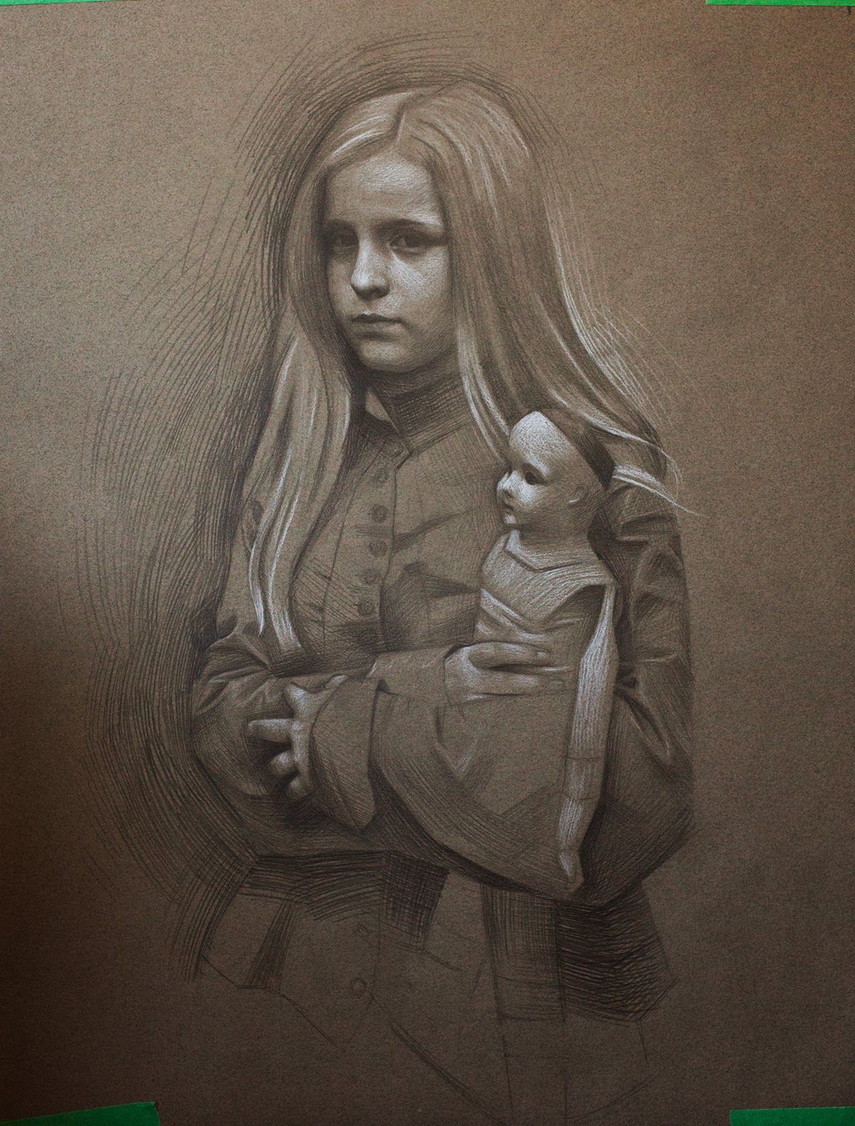
Graphite and white chalk drawing for Poppet
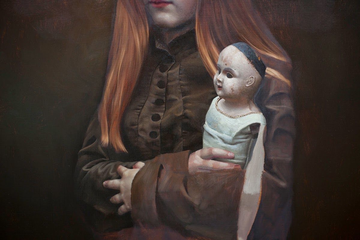
Maddie is wearing a fantastic, military-inspired silk blouse from Victorian times, and the empty-eyed doll is straight from your worst nightmares. In the original reference photos, Maddie is far more upright. I stooped her over, head forward, and arms moved in. The difference is subtle, but the result is a pose that has more tension. I was thinking about Lucas Cranach the Elder's beautiful princess portraits when I was doing this. Do you know how he always forces a lovely slouch into his sitters?
, Lucas Cranach the Elder, c.1520, oil on panel, 41.1 x 26 cm, Musee du Louvre, Paris, France")
Portrait of a Young Girl (Magdalena Luther), Lucas Cranach the Elder, c.1520, oil on panel, 41.1 x 26 cm, Musee du Louvre, Paris, France
The next step was a vellum color study.

I knew I wanted a dark, warm painting. I hanker after simplicity, and I really wanted to get away with a runny umber wash background at this early stage.
Next, a head study. This took a couple of passes and had a rougher finish than my everyday work.

After all that prep work, it's time to start having fun finally. Confident in my colors, I dived right in. After toning the panel with umber and transferring my drawing, I started cherry-picking all the fun parts.

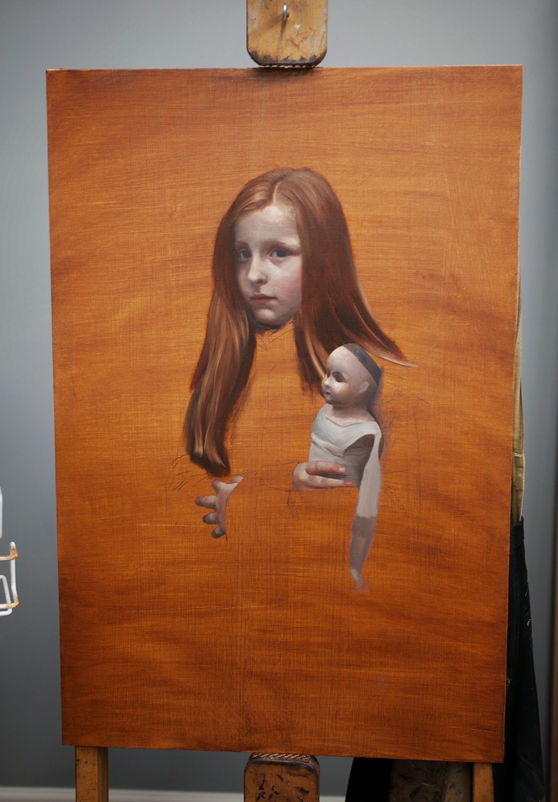
Some people have asked me if this is window shading (also known as "tiling," an approach whereby the entire painting is brought to a finished piece by piece). I'm not a window shade painter. I believe in working all elements of a painting to a finish together, leaving room for serious revision if necessary. I would have massed in the background and the coat first, but I wanted a transparent effect in those areas. Everything painted here is still a pass or two away from being finished. I like to build up accuracy and texture, stage by stage.
The hair, however, was taken to a near finish. I couldn't resist playing with transparency here too, and multiple passes would have killed the effect. This whole painting was a flirtation with transparency, umber, and, as you will see later on,
I finally felt ready to lay in the background. Backgrounds are challenging for me. They seem too simple, so I begin to overthink them. And yet, if I intentionally underthink them, they end up rotten. I laid one down, hated it, and wiped it. Part of the problem was that my umbers ( , , ) were drying so rapidly that by the time I had finished laying in the background, the paint I had laid down first was already sinking in. It was impossible to work the background as a whole.

I returned two days later and LOADED my paint with linseed oil. This time the paint stayed glossy and true to value, and I had a large window of time to work it, make myself some coffee, come back, hem and haw, and rework it. The trick was to introduce some green into the background, which, incidentally, was the exact solution I used in Huntsman and Herdsman. And it was only at this point that I realized I had lapsed into the same color field as that other painting. So much for a bold new direction.
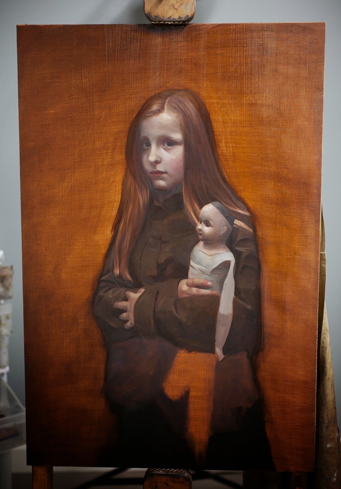
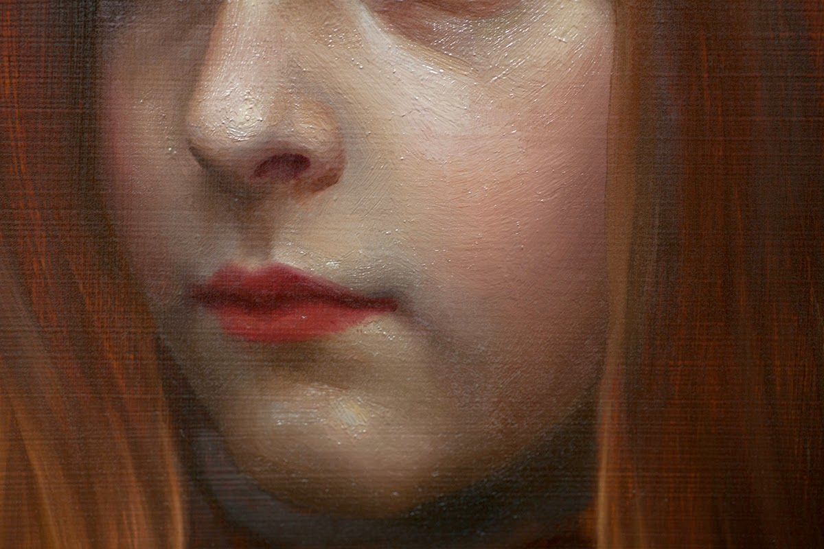
With the background dry and safe from the heel of my hand, I went into the face for a second pass. I start by laying in broad sweeps of color and then refining.


The eyes above aren't great, but I try to leave them for the final pass. By then, things have gelled in my head, and they come quickly. I figure it's twice as much work to nail the eyes in the second pass as it is in the third pass, so I do what comes naturally.
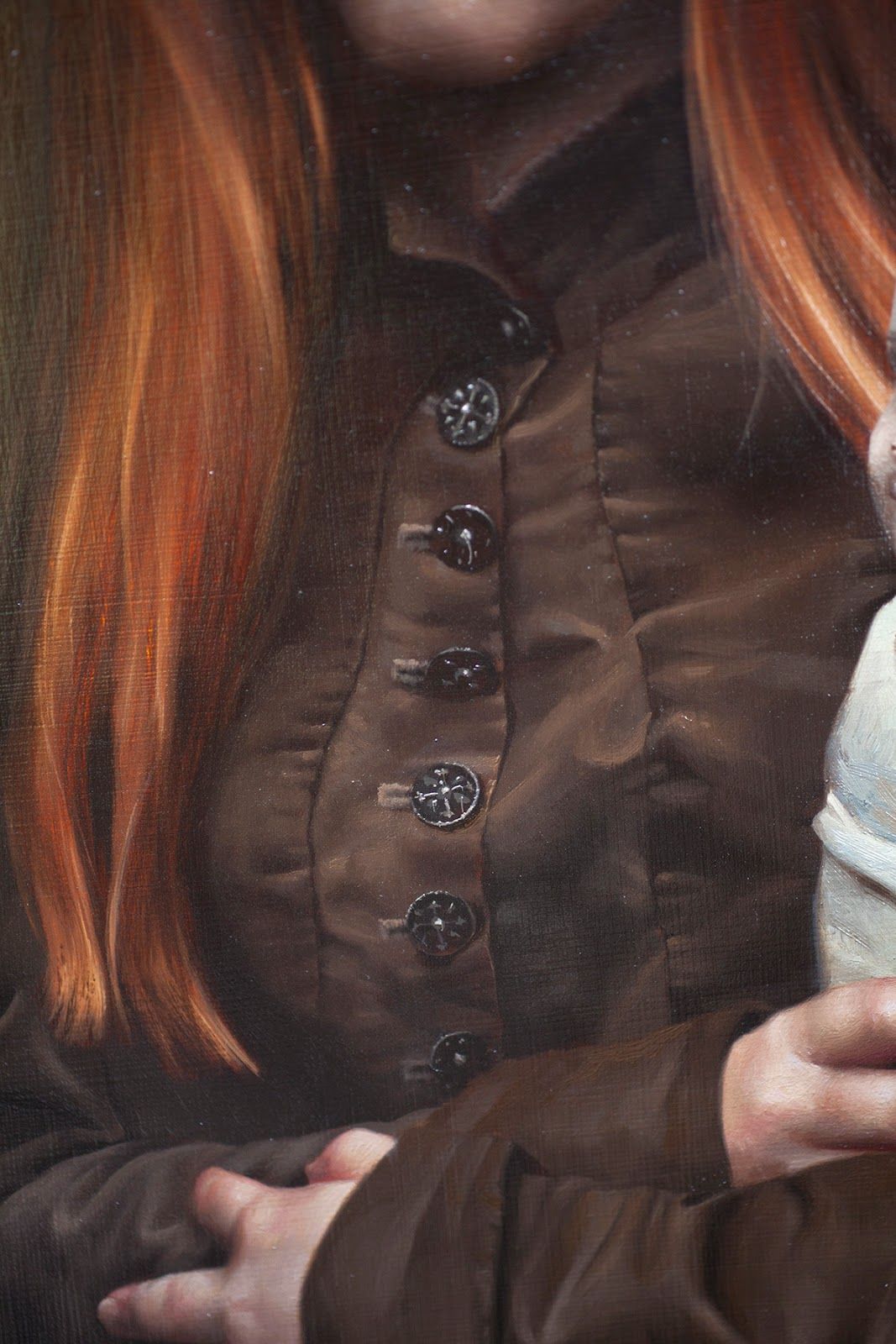
Remember how I said I got all flirty with Velazquez Medium? I haven't used it much in the past. Usually, I put a big dollop of on my palette, and I use that to beef up my lights when I want an impasto. However, since I've become an unofficial Natural Pigments spokesperson and field emails every week asking me about their various products, I felt inspired to give Velazquez Medium another whirl after a blog reader had emailed me with questions that I couldn't answer. Velazquez Medium and Impasto Medium are very similar. Both act like collagen injections in your paint, but Velazquez has a stringy, goopy consistency. I wasn't expecting to find a massive difference in the handling by the time it had been mixed into my paint, but there was a distinct personality to it after all. It drags out beautifully and tacks up on itself nicely. Plus, since it's stringy, you can make the most incredible filament-like highlights. You'll see what I mean in my buttons down below. At the moment, I prefer Velazquez Medium, but Impasto Medium is still a totally awesome product. I can see how some people might get frustrated by using Velazquez Medium for the wrong application. I was using it to pick out the highlights in a model's eyes the other day, and the paint just wanted to act like a piece of string. All my highlights were noodle-like instead of perfect pin-pricks, so I can see myself keeping Impasto Medium handy.

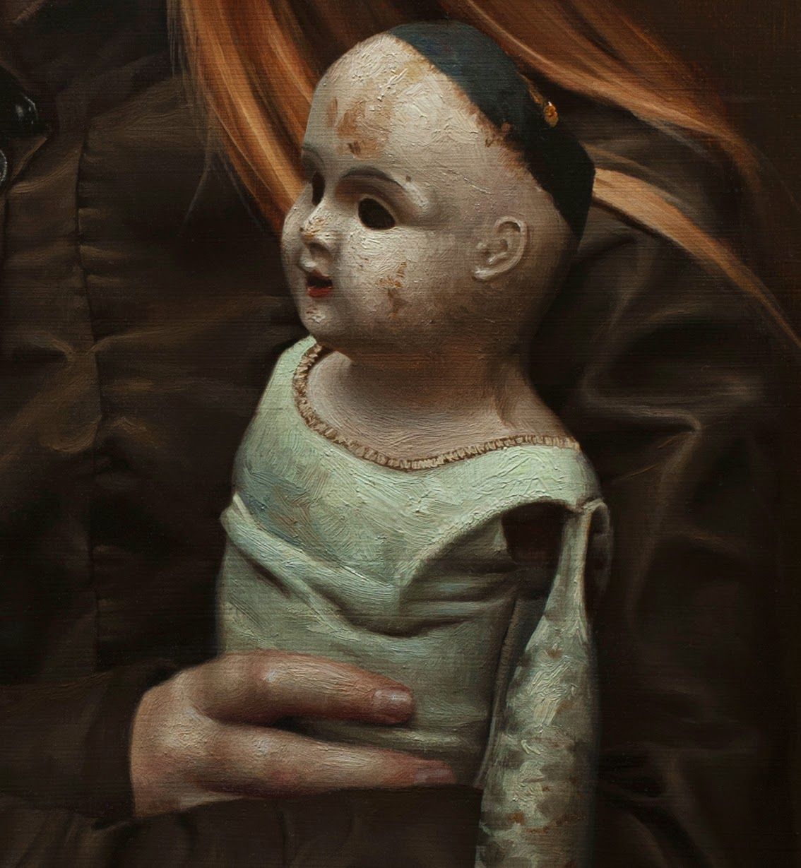
Below is the result of a glorious play day with Velazquez medium. Know this about me: I have been struggling to paint with body for YEARS. It was so thrilling to paint this.
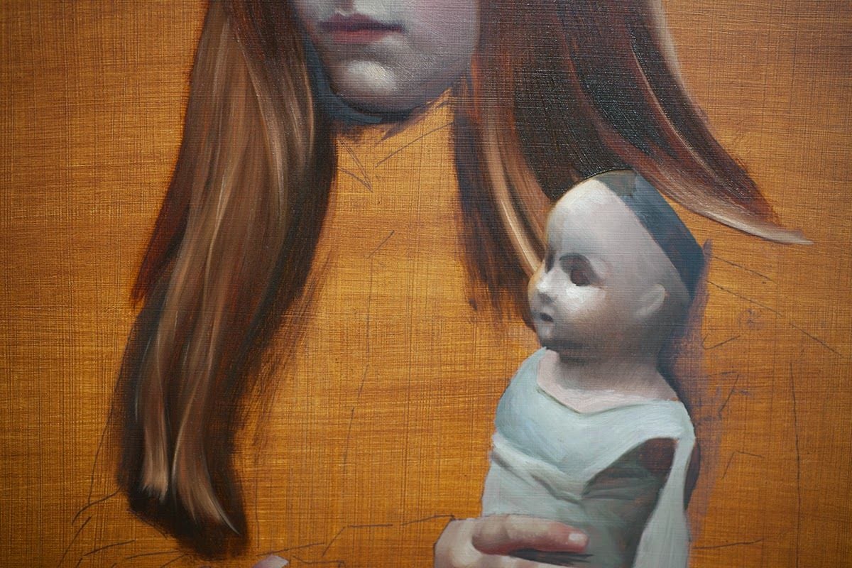
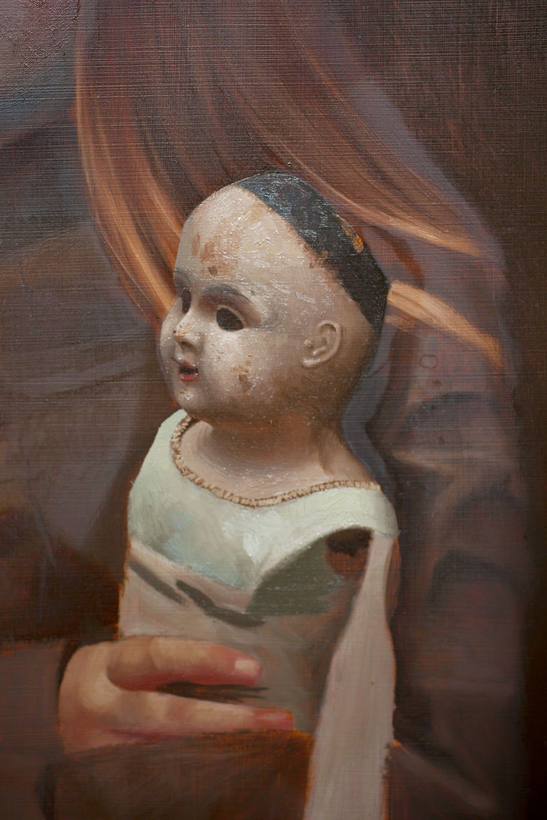
The doll presented an opportunity for more fun with Velazquez medium:
And finally, that silk blouse. There was no way around putting my butt in a chair and working at it bit by bit, super slowly, with a good audiobook in the background.
I warned you about the buttons. This was the last thing I did on this painting, and that last little detail made it all come together. The little highlights on the buttons are brought to you by Velazquez Medium. If you enlarge the image, you can see the stringiness of the paint and how it adds a glittery effect to the highlights. Yum.
A couple of close-ups:
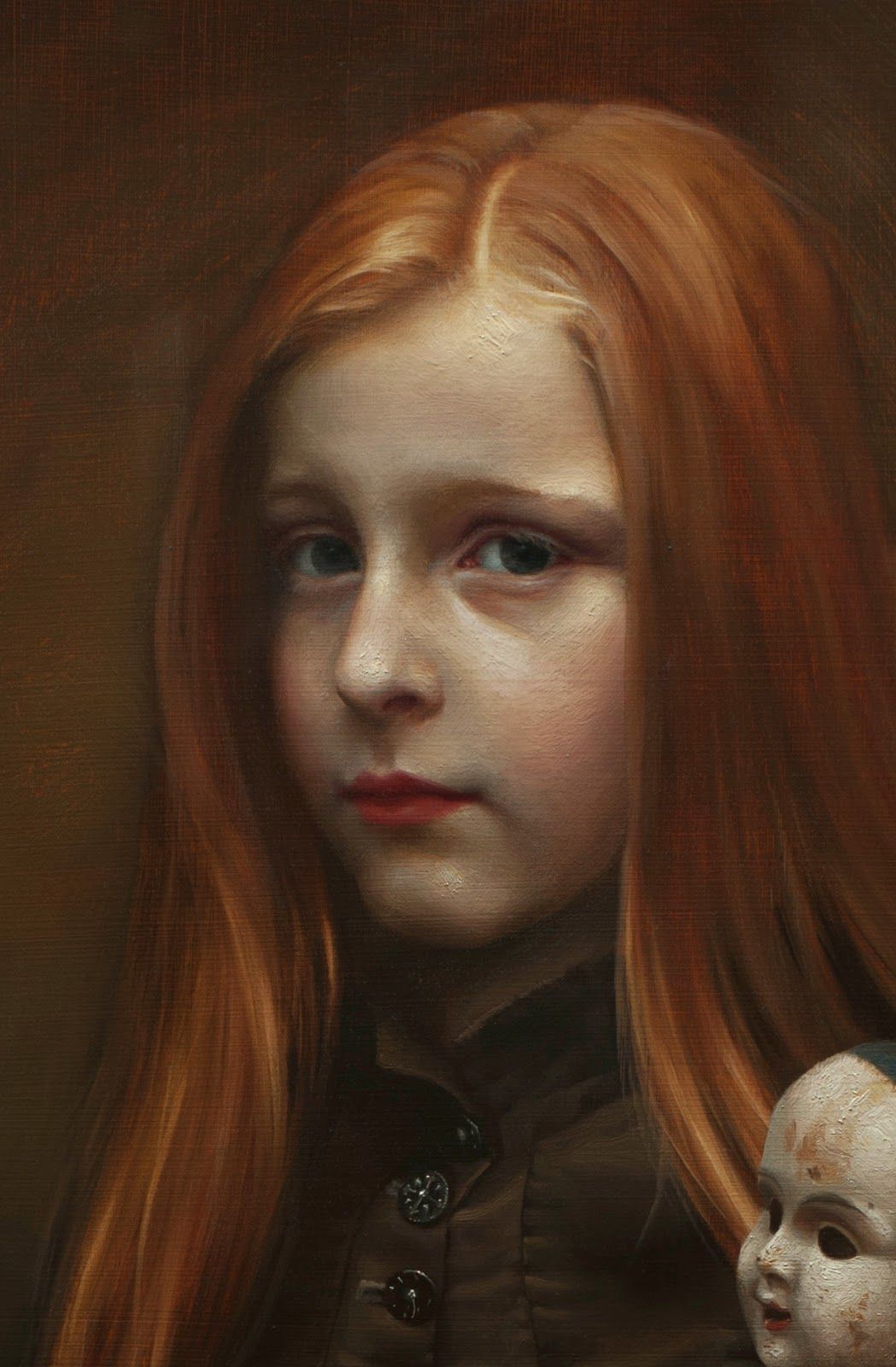
Why is the painting called "Poppet"? There's no complicated backstory or poetic inspiration this time. Maddie is growing up quickly, and I wanted to get in at least one more painting of her as a child. Soon she will start looking teenager-ish, egads. "Poppet" is a term of endearment for a small child, and at one point, it meant a small doll or effigy resembling human form. From it, we get the word "puppet." The well-loved doll in this painting is ratty, worn out, and on its last legs. It will soon be time to put it aside.
About the Artist
Katherine Stone paints on Vancouver Island with her artist husband, David Gluck. In recent years she has received recognition for her work from the Portrait Society of America, the Art Renewal Center, and many popular magazine competitions. Her painting Poppet will be in the 2015 Portrait Society of America finalist exhibition in Atlanta, where it will be eligible for a higher award.
Read more about Katherine's work ay her blog, Painting Stuff to Look Like Stuff.
See more of her work at katestoneart.com.


